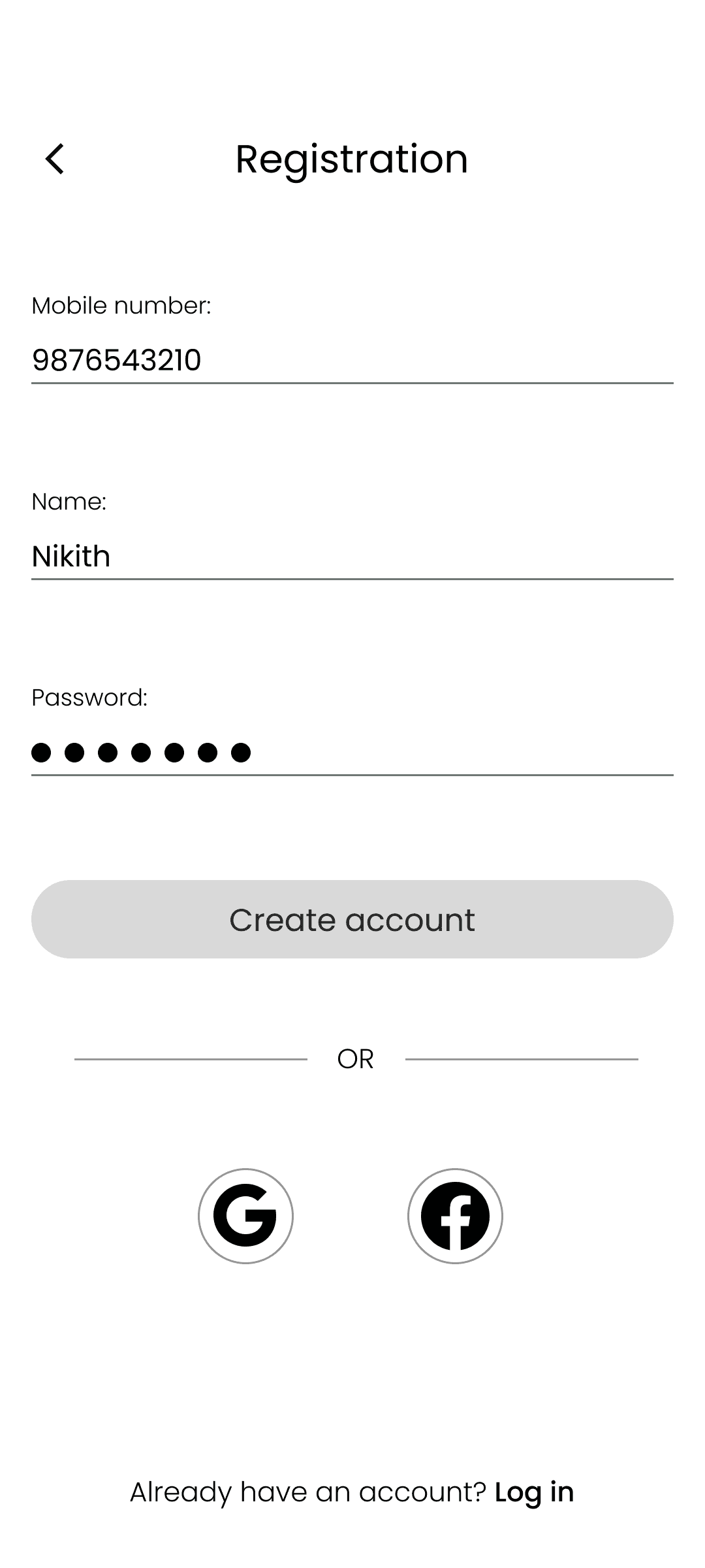
Overview
Project type
Fictitious personal project
Tools
Figma, Skype, Figjam, Google Forms
Timeline
2 months
Target users
Students and working professionals
Problem
Have you ever found yourself searching for a budget-friendly yet high-quality place to hang out with friends or colleagues? Finding a place that is both affordable and top-notch to socialize with friends or colleagues can be quite challenging. Limited seating and staff in small-scale restaurants and cafes often lead to lengthy wait times for securing tables and placing orders.
Solution
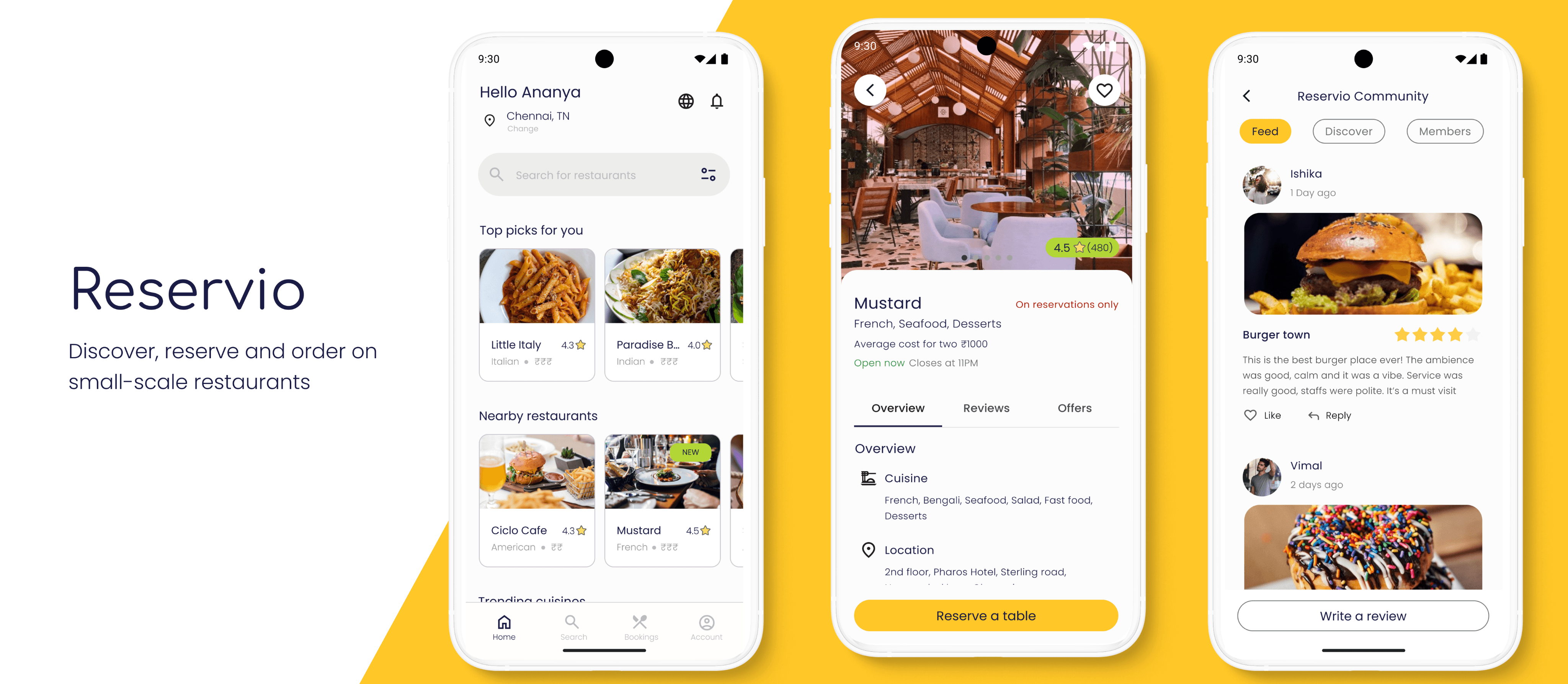
Reservio helps people find a suitable hangout place and make reservations. The goal is to:
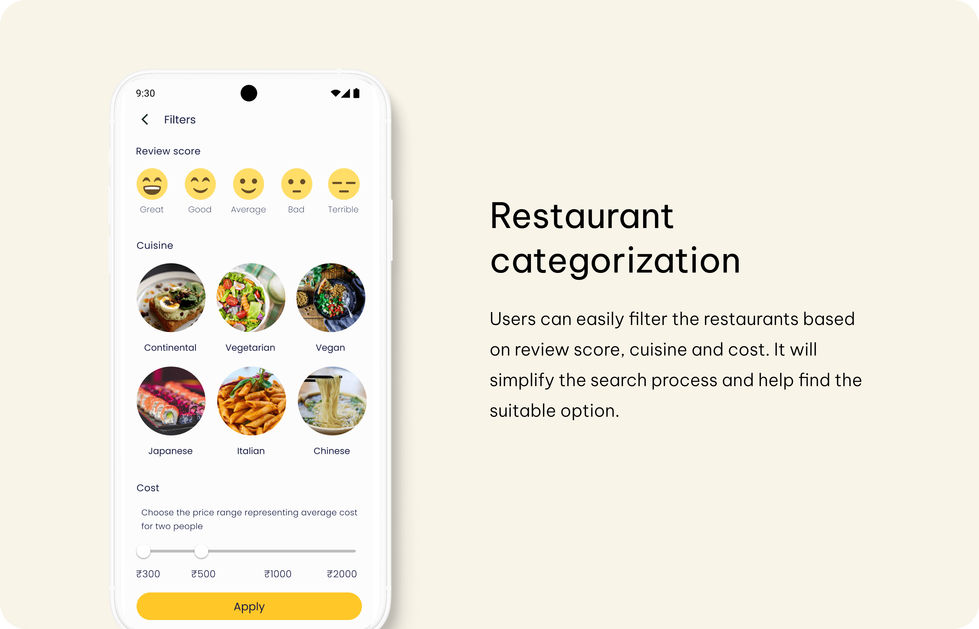
Categorize restaurants based on price, location, rating, and cuisine
Allow people to pre-order from home to save time

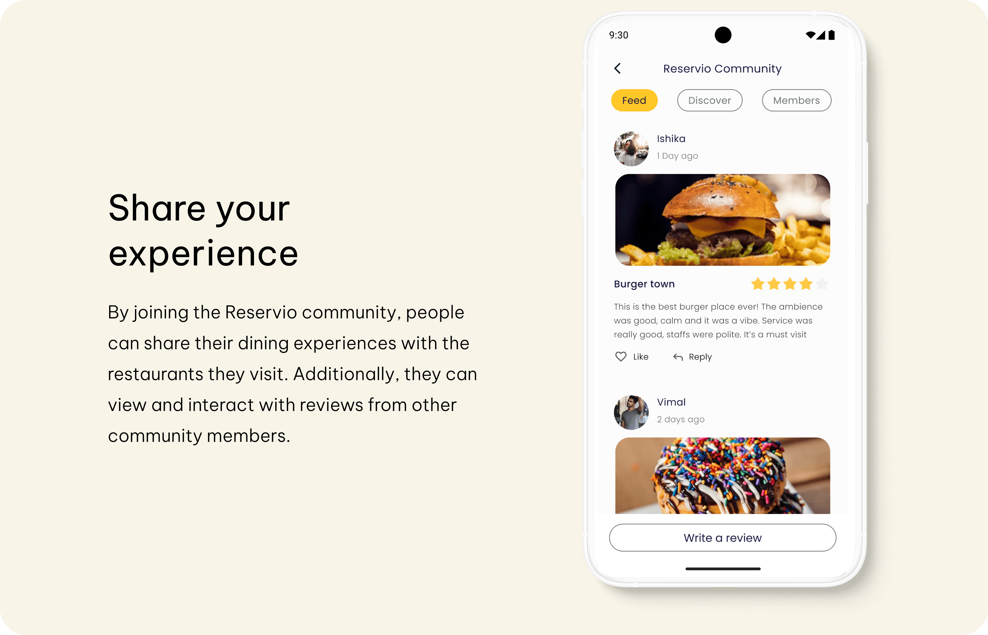
Allow people to share their experiences in the community
Business opportunity
Small-scale restaurants and cafes can benefit greatly from this app. It's common for people to feel unsure about the quality and service provided by smaller restaurants. Reservio can help establish trust with potential customers and ultimately lead to increased business.
Design process
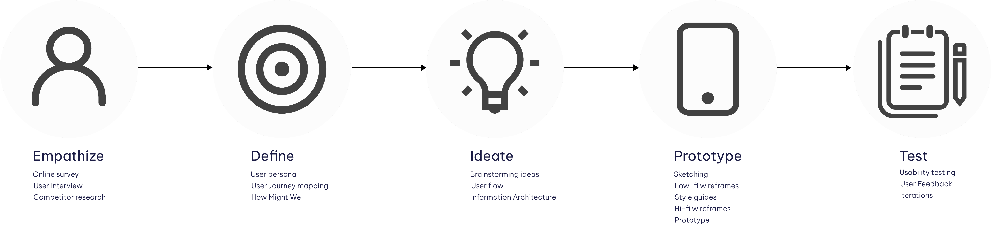
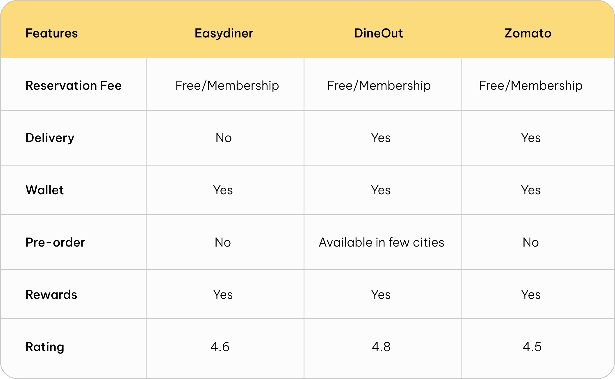
Competitor analysis
To get to know on the current features of the reservation apps, I did a competitor analysis of popular apps available in India.
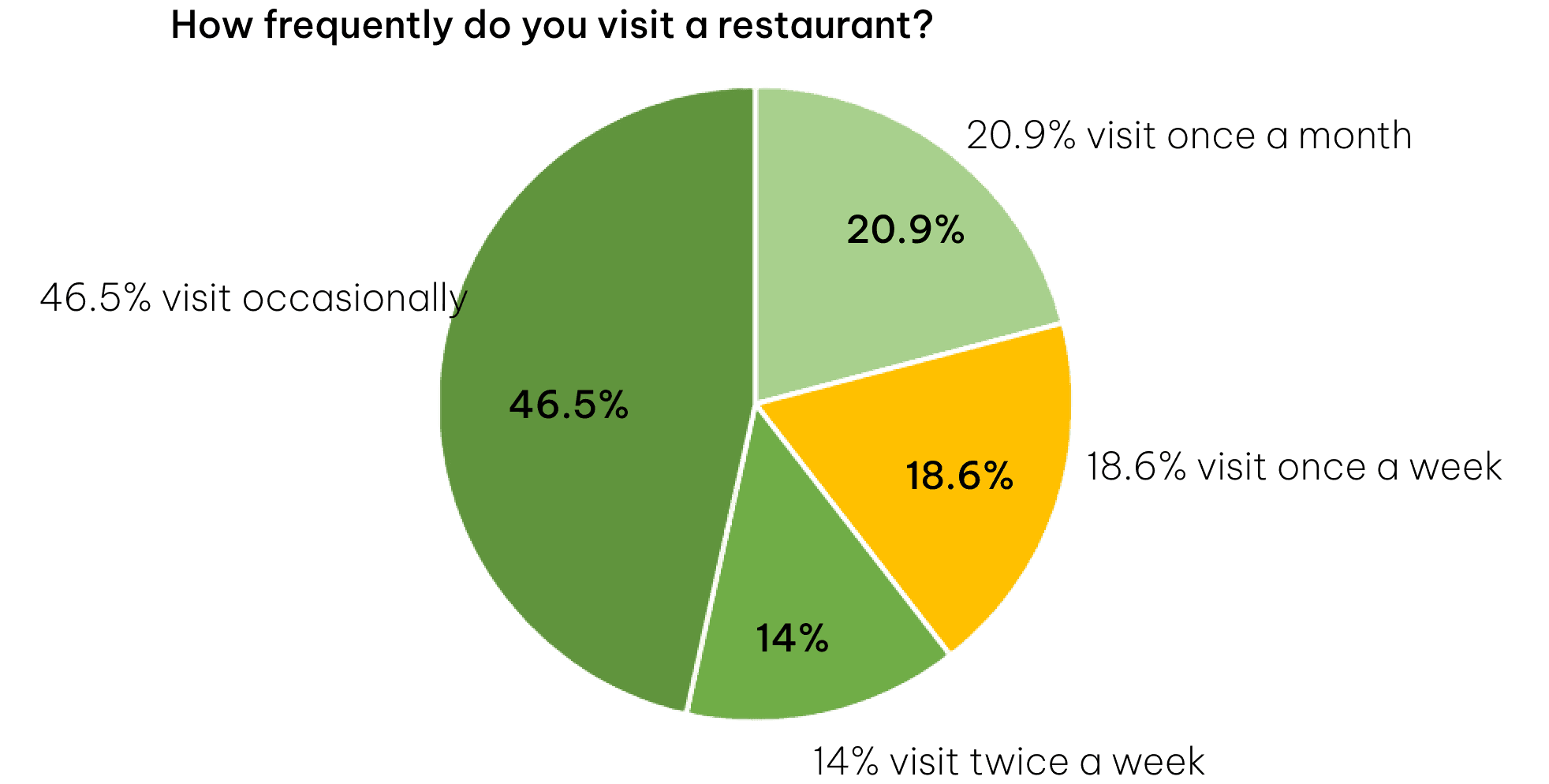
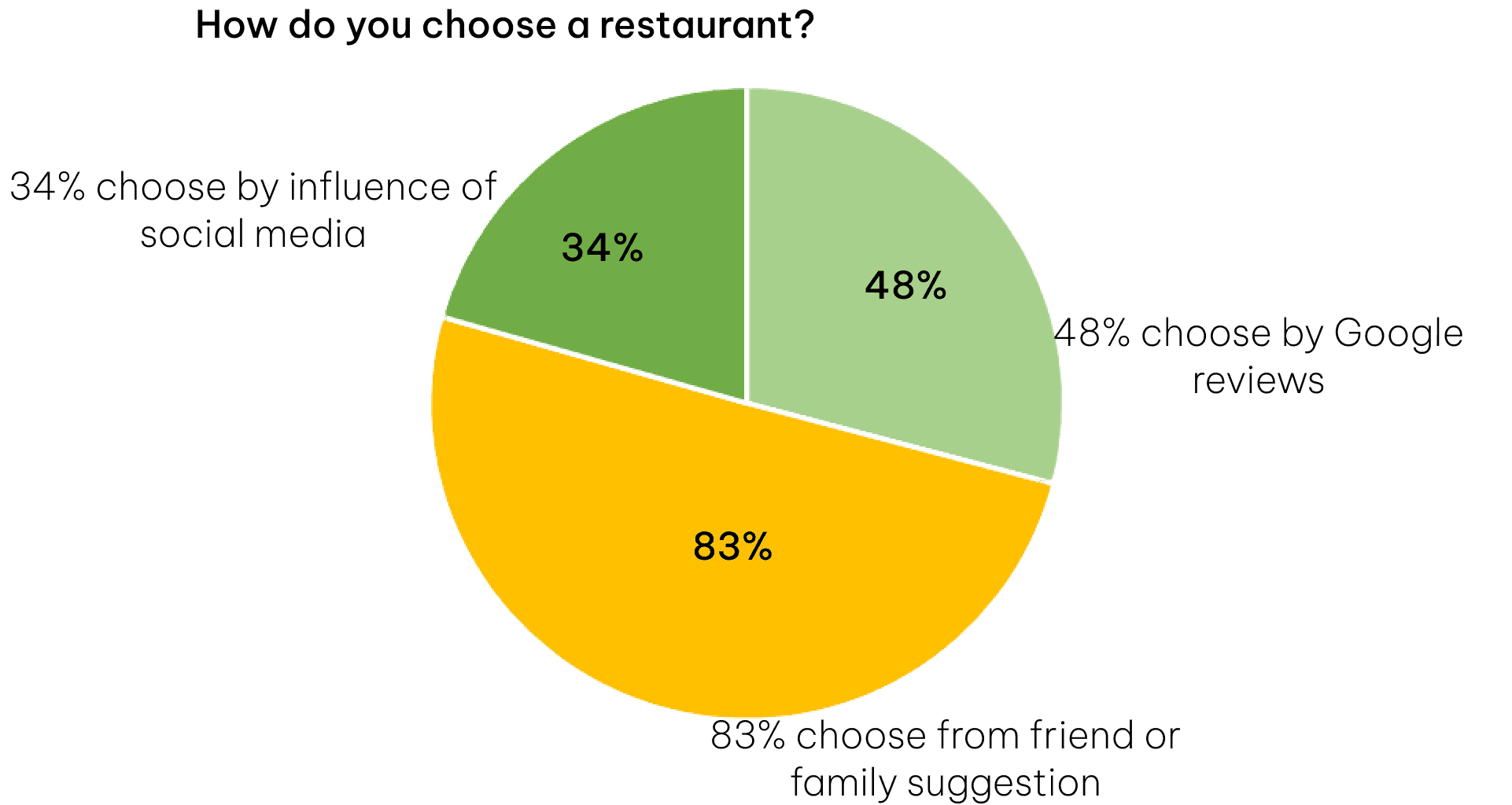
Survey
First, I started with an online survey, with a total of 43 participants aged between 18-60. The survey questions were about their visitation to a restaurant, choosing a restaurant, and their reservation behaviors. The target audience was mostly working professionals and students.


User interview
To understand user needs and pain points, I interviewed 5 individuals age 20-30 who are either students or employees. I asked questions about:
Their thoughts on small-scale restaurants
Their ways to discover new restaurants
Their reservation methods and experience
Factors they consider while choosing a restaurant
Insights

3 of 5 people are willing to wait to get a table

People choose a restaurant based on Reviews, Ambiance and cost


4 of 5 went to a restaurant that doesn’t allow walk-ins and turned back

3 of 5 said the online reviews aren’t really trustable

2 of 5 are willing to wait for their food. They like to spend time there
Most people discover new restaurants through Instagram ads/posts
Whenever I find myself waiting for a table, I feel disappointed and annoyed
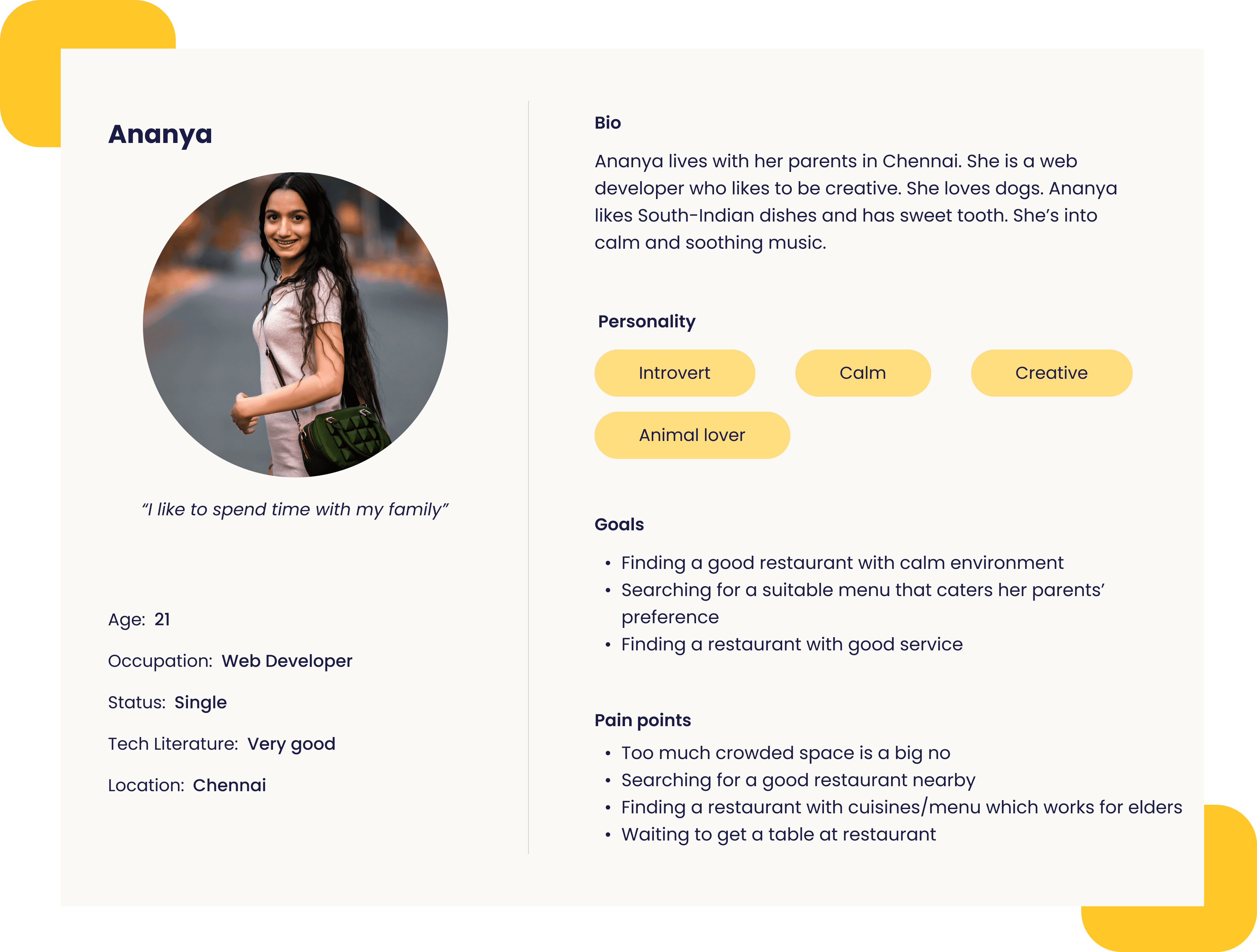
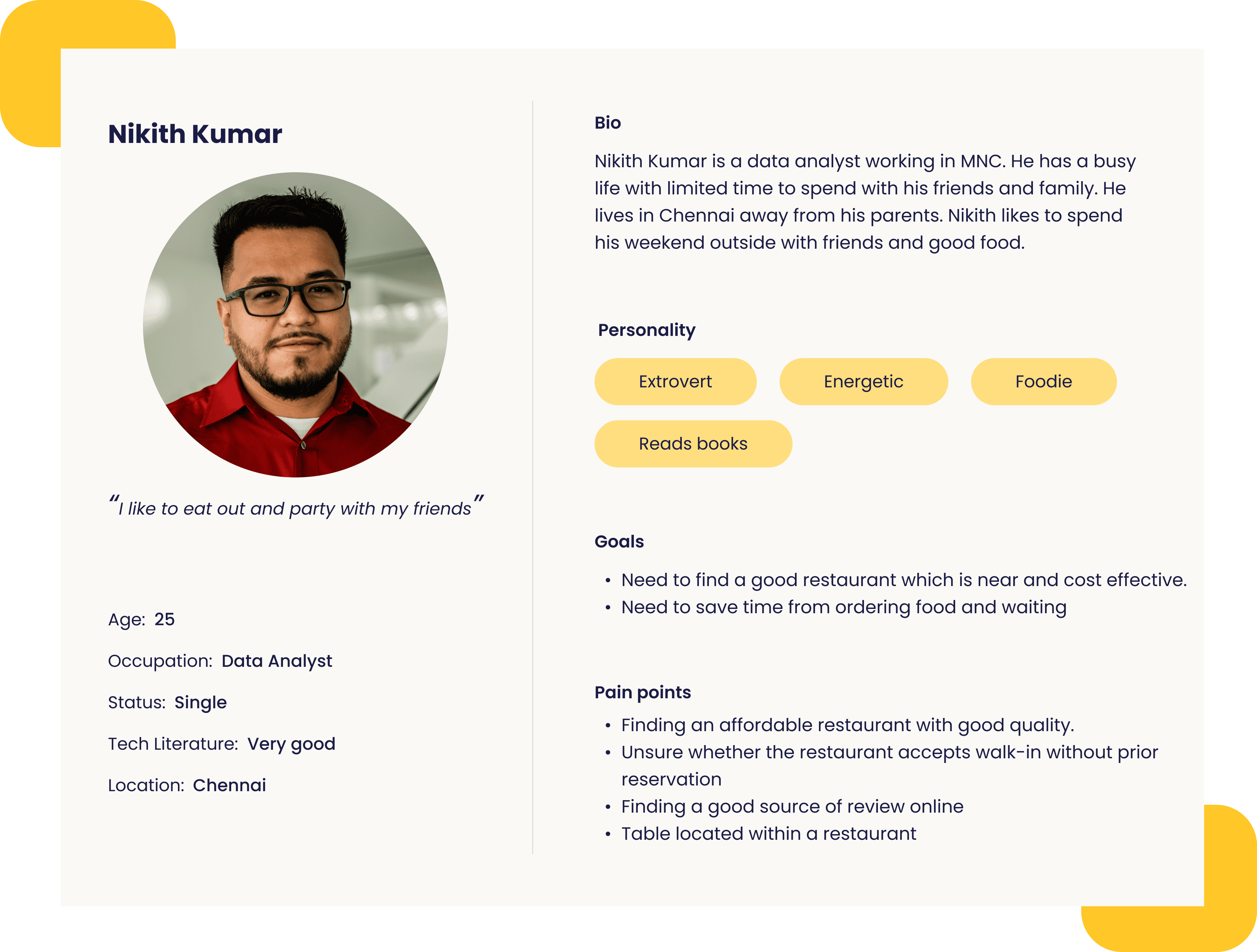
User persona
Based on the interview, I created 2 personas to represent my users. These are two types of people, who like to spend time with family, friends or colleagues. Click on the image to enlarge.
User journey mapping
To understand how users might interact with my app, I created a scenario for my persona and created Journey map. This helped me find the opportunities to improve user experience.

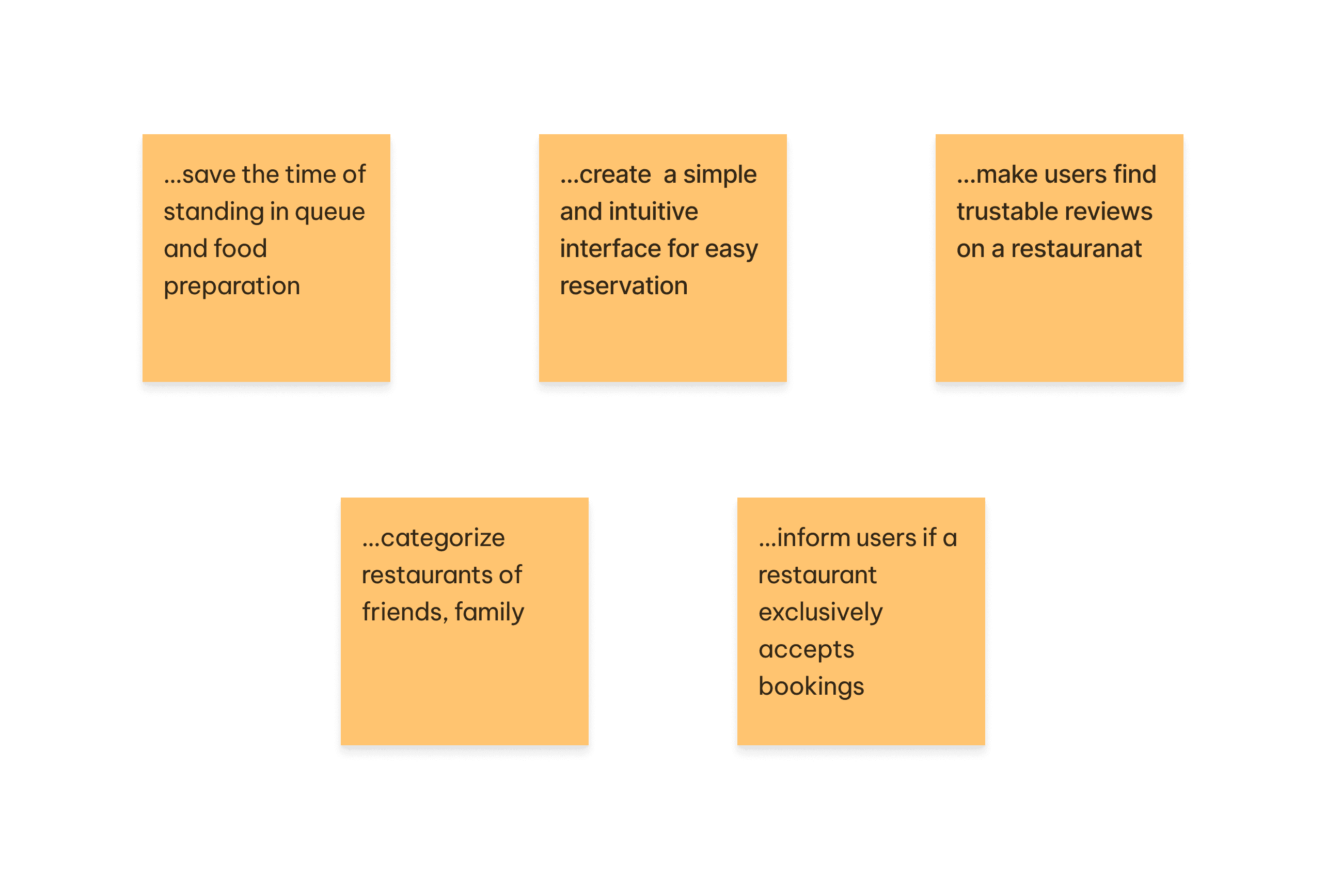
How Might We...
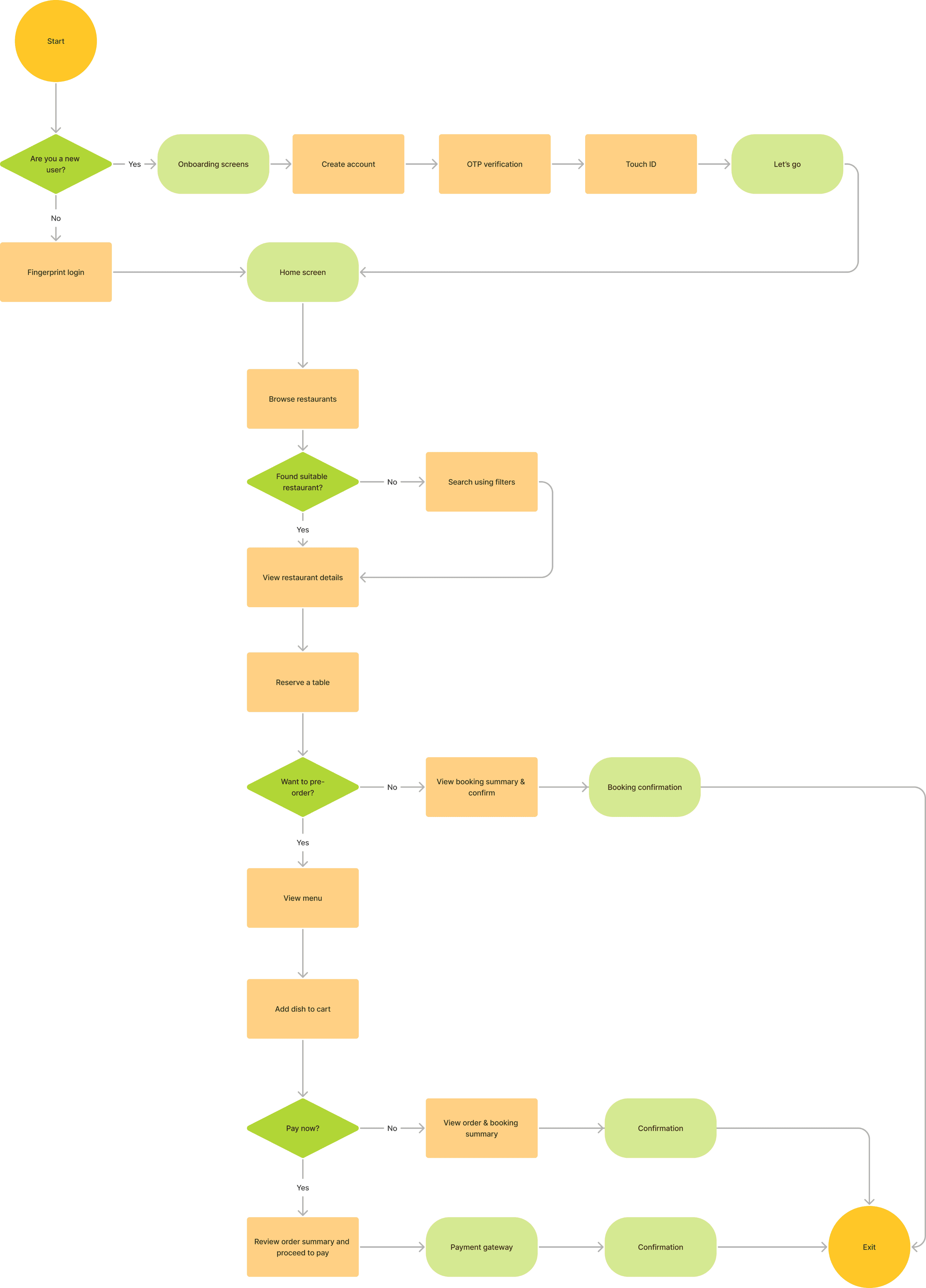
User flow
I walked through the user flow to complete a task: search for a restaurant, reserve a table, and pre-order.
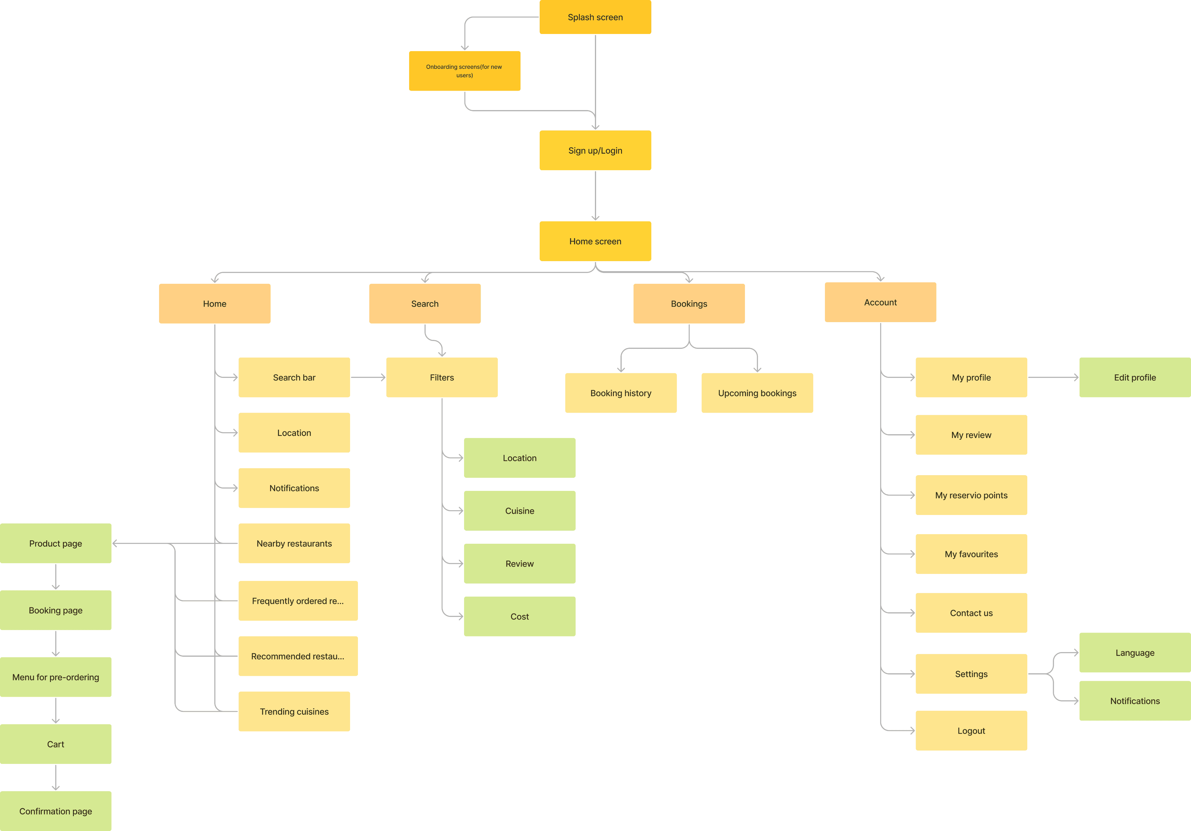
Information Architecture
To understand the structure and hierarchy of the screens of my app, I created information architecture
Paper first
I sketched out my initial ideas before proceeding to the digital wireframing and iterations.


From paper to digital
Then I created interactive low-fi wireframes to collect feedback from my friends.


Visual design
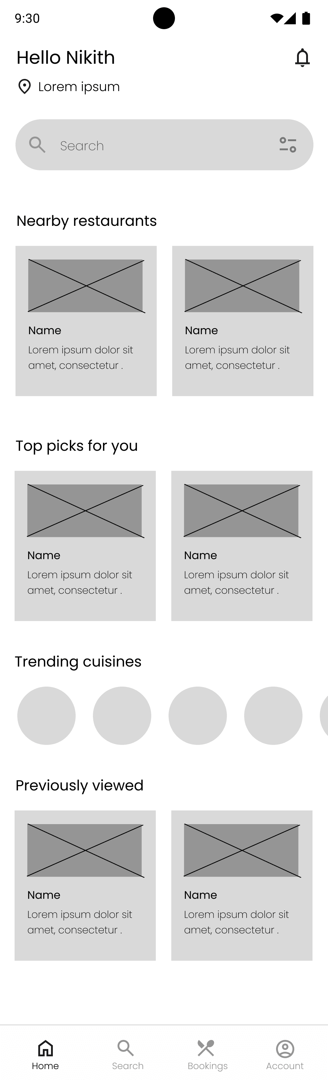
Home screen

Filter and search

Restaurant and menu page
Design iterations

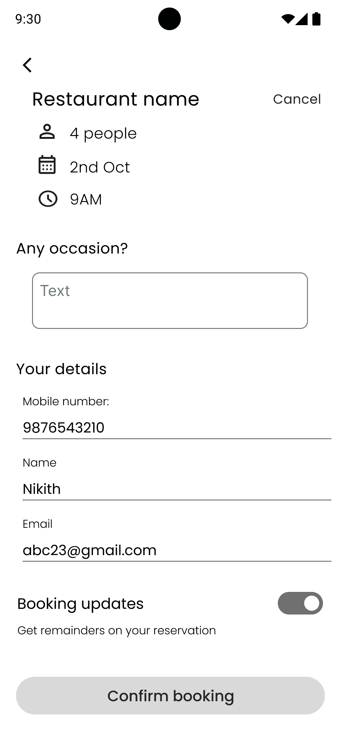
Pre-order while reserving
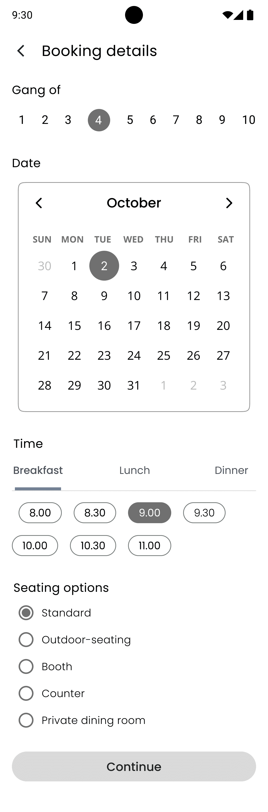
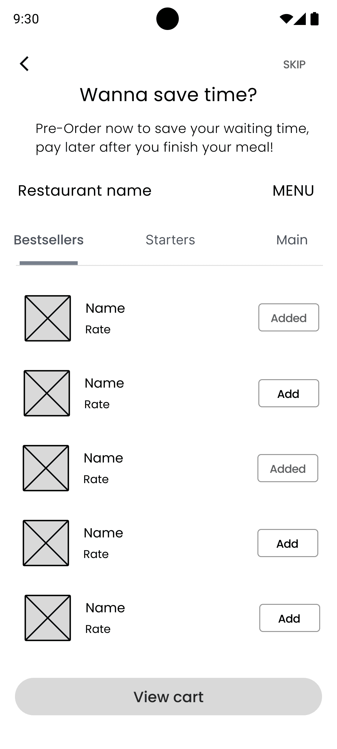
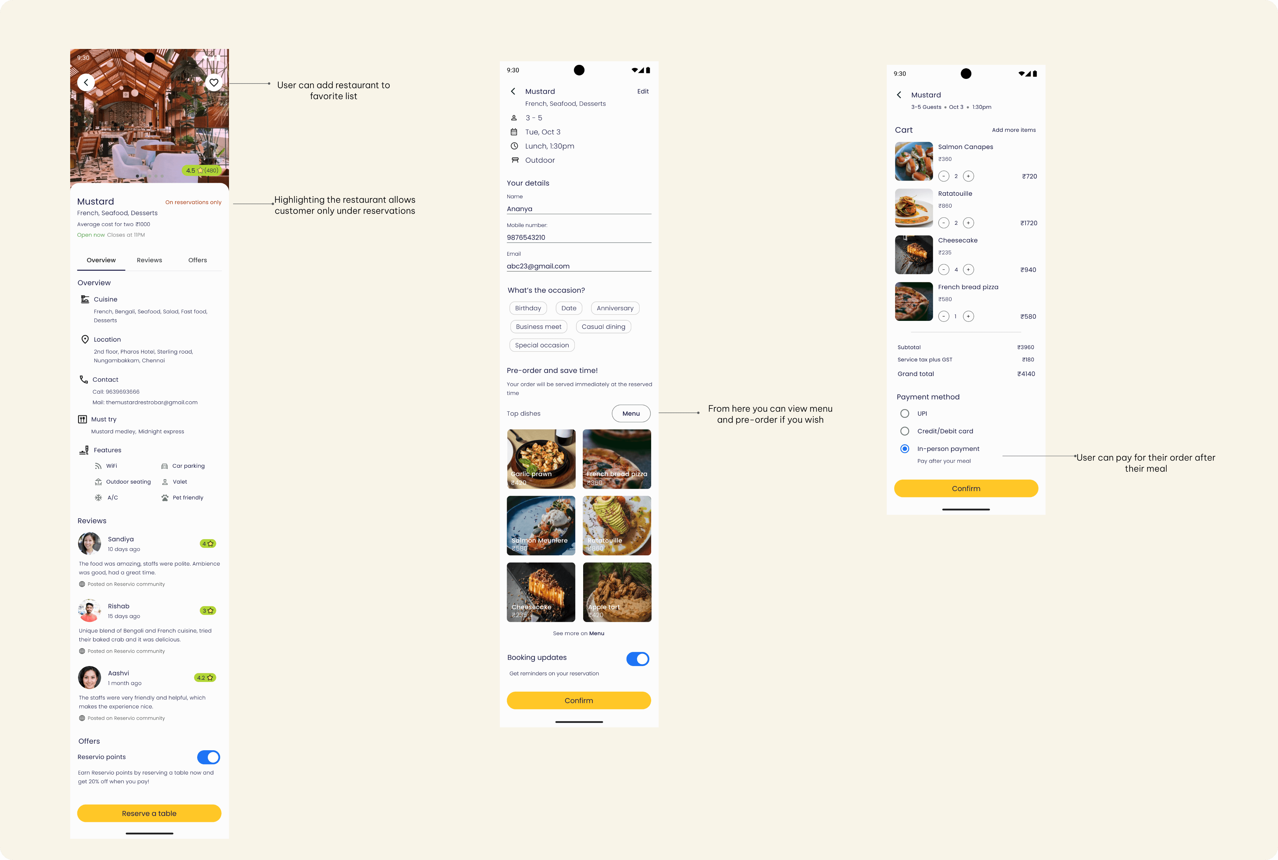
In the first wireframe, user can pre-order their food after reserving a table with the option to skip. But when I did a usability test with my friends, they found it confusing and it added more screens in the process. For this reason, I included the pre-order option in the reservation screen.

Option to choose type of meal
Originally, I only had the option to choose between breakfast, lunch and dinner. But my friends were asking about brunch and evening while doing testing. So I added the Type of meal to choose from.

On reservations only
In the wireframe, I added a bookings-only badge to indicate the restaurant exclusively accepts bookings. While doing the usability test, my friends did not understand what it meant. So I changed it to ‘On reservations only’
Prototype
Style Guide
I followed Google Material Design3 guidelines for my components and used Google material symbols.
Colors

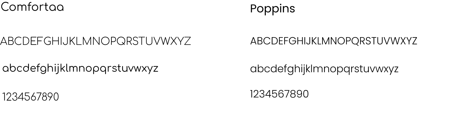
Typography


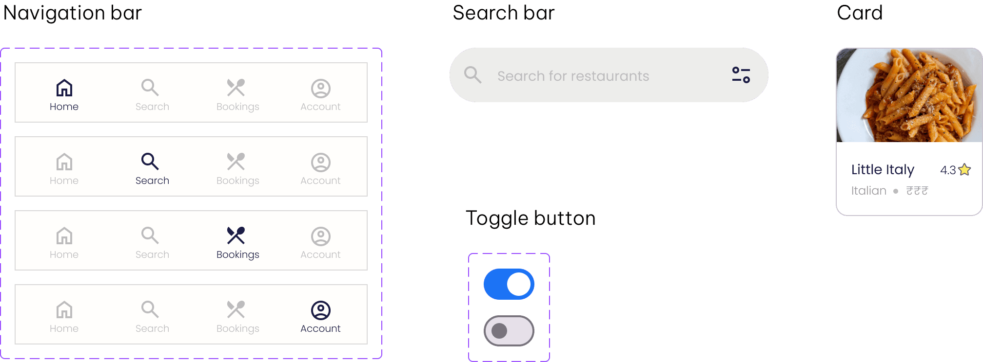
Components
Conclusion
Feedback
After going through iterations, my friends gave me feedback that the design is clear and user-friendly. They also appreciated its aesthetic and minimalistic appeal.
What I learned
I learned the importance of whitespaces in UI. Consistent use of grid and whitespace helped me design the screens with ease.
Also, I learned that understanding users is important. We cannot have expectations from users and their opinions vary.
Future research
Right now, the concept is focused on helping users to make reservations and pre-order their food. But with continued iterations, there are some the future features I could add:
Giving the user to choose their table, by providing a 2-dimensional table layout
A feature to split the bill among the users